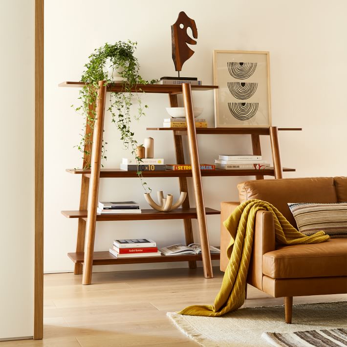
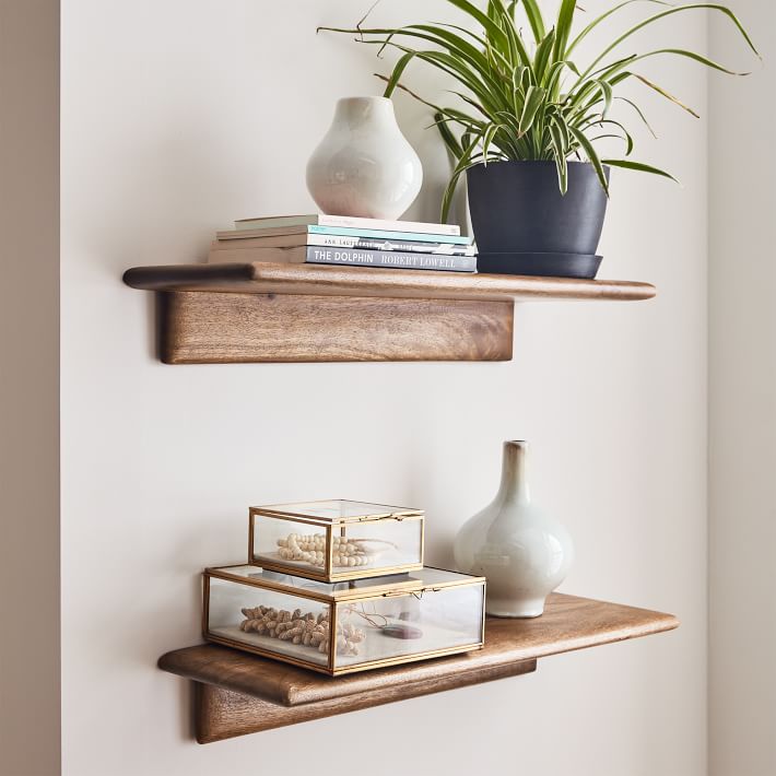
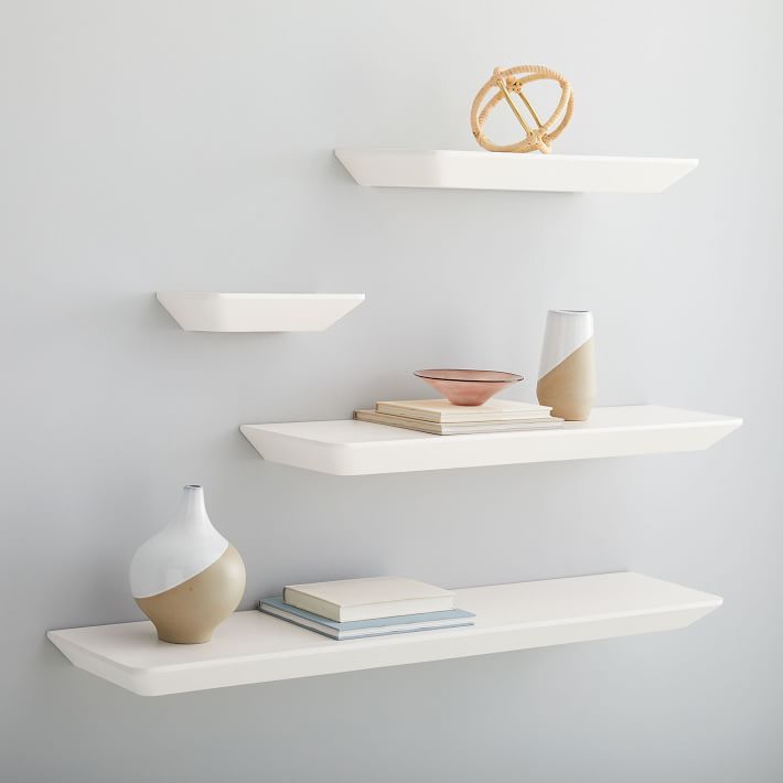
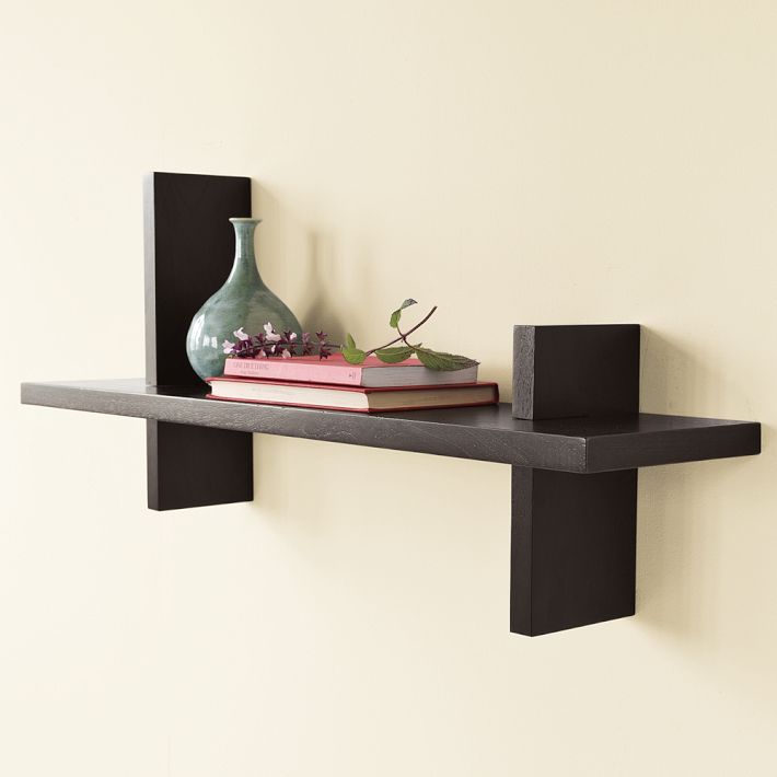
When you bring a West Elm shelves unit into your space, you’re not just adding storage—you’re setting the stage for a display of design and personal expression. The art of shelf arrangement is a blend of practicality and aesthetic prowess, allowing anyone to transform a bland wall into a curated exhibit. These styling tips are designed to turn your West Elm shelves from plain to picturesque, using techniques that play with balance, texture, and spatial awareness.
Starting with a Clean Slate
Clear and Categorize Your Items
Before you dive into styling, empty your West Elm shelves and start from a clean slate. Visually group your belongings by type—books with books, pottery with pottery. This doesn’t just aid in the organizational process; it aids in conceptualizing your design. By categorizing items, you gain clarity on what should be the shelf’s stars—those items you want to highlight for their aesthetic or sentimental value.
Choosing a Focal Point
Every story needs a central theme, and every shelf display benefits from a focal point. It draws the eye and sets the pace of the viewer’s experience. Choose an item that stands out due to its size, color, or uniqueness. This could be a vintage lamp, an artisan vase, or a framed piece of art. Position this piece on a shelf at eye level to engage onlookers and ground your display.

Balancing Function and Aesthetics
Mixing Practical and Decorative Elements
Strive for shelving that offers more than just good looks—think multipurpose. Combine utilitarian and decorative elements to give your shelves both function and flair. Nestle baskets that conceal everyday essentials among prized possessions. Books can act as pedestals for small sculptures, and pretty storage boxes can hide less-attractive paperwork while contributing to the visual story.
Varying Heights and Shapes
To instill rhythm and intrigue in your display, incorporate items of various heights and shapes. Tall slender candlesticks placed next to shorter succulent planters create a cascade effect for the eyes. Nestle round, organic shapes amongst angular ones to soften the overall look. This subtle but intentional variance captivates onlookers and prevents the display from becoming stagnant.
Embracing Negative Space
Allowing Breathing Room
In the quest to show off your collection, it’s easy to go overboard. However, overcrowding can stifle your styling. Allow for negative space—empty areas that let your display breathe. This space helps to frame and accentuate each composition, giving it the spotlight it deserves.
Grouping with Purpose
As you curate groupings within your shelves, think of them as individual vignettes—each one telling a part of your overarching narrative. A set of hand-thrown pottery lends an artisan feel, while a cluster of family photos invites nostalgia. Be intentional with your groupings, and consider the conversation between the items within a group and how they relate to your focal point.

Incorporating Texture and Color
Adding Layers of Texture
Texture infuses your shelves with life. Pair the glossy finish of ceramic figures with the ruggedness of woven baskets or matte stoneware. Add metallic elements to catch the light and contrast with the matte surfaces. Play with these textures to bring a tactile dimension that entices and engages.
Using Color to Tie Things Together
Color is a powerful tool that acts as both an individual expression and a unifier. It can be a delicate thread that weaves through your shelf display or an exclamation point that punctuates it. Work with a color palette that enhances the mood of your room. Choose a monochromatic scheme for a sleek, modern feel or create bursts of colors with intentional pops that stand out amongst neutrals.
The Finishing Touches
Assuring Cohesion
Take a moment to review your shelving composition from different angles. Make minor adjustments to create a flow that’s visually pleasing and balanced. Perhaps reposition an item to create more symmetry or intersperse color more evenly. This scrutiny ensures that your shelves tell a cohesive story, each part contributing to a well-orchestrated visual dialogue.
Updating with Seasons or Trends
A great shelf display is never static. Update it with seasonal décor to reflect the time of year, or incorporate new trends you’re drawn to. Rotating items not only refreshes your space but allows you to reconnect with your belongings. The change in design also keeps your shelf styling skills sharp and evolving with your personal taste.

Leveraging Lighting and Accessories
Illuminating Your Display
Lighting can dramatically change the ambiance of your room and the appearance of your shelving. Consider the use of small, battery-operated LED lights under shelves to cast a warm glow on the items below. Or, if shelving near a natural light source, understand how the changing daylight will interact with and highlight different parts of your arrangement. A well-lit shelf can bring out colors and textures, making them more vibrant and eye-catching.
Accessorizing the Space Around
Don’t just focus on the shelves themselves but also consider how the space around them can complement your arrangement. Hang artwork, mirrors, or tapestries on the adjacent walls to create a gallery feel. Place larger items, like plants or floor sculptures, near the shelving unit. These additions can make your shelving appear integrated and grounded within the greater context of the room’s design.
Reinventing with Seasonal Flares
Celebrating the Changing Seasons
A refreshing way to keep your shelving display lively is by introducing seasonal elements throughout the year. Welcome spring with fresh flowers or pastel accessories, embrace summer’s vibrancy with nautical themes or greenery, add warm tones and textures to reflect autumn’s coziness, and for winter, incorporate twinkling lights and metallics for a festive touch. Seasonal updates are opportunities to celebrate the time of year and keep your decor feeling current and thoughtful.
The Subtle Art of Thematic Transitions
Transitioning your shelving decor with the seasons doesn’t have to mean a complete overhaul. Subtle shifts in color palettes, adding strategically placed seasonal items, or rotating out specific themed pieces can be enough to convey a change in season. This approach allows for a natural, evolving aesthetic that keeps your space feeling fresh without being overwhelming or overly thematic.
Celebrating Collections and Memories
Showcasing Personal Collections
Your shelving should not only be visually appealing but also a place where you can showcase the things that mean the most to you. Whether it’s a collection of vintage cameras, specialty cookbooks, or handcrafted ceramics, your shelving can serve as a museum of your life’s interests and journeys. Displaying these collections can offer a unique insight into your hobbies and memories, making your living space more personal and inviting.
Creating a Gallery of Life Experiences
Think of your shelves as a timeline that showcases the narrative of your life’s experiences. Photo frames capturing cherished moments, souvenirs from travels, or heirlooms from loved ones can all find a home on your West Elm shelving. By turning your shelf into a gallery of personal history, you’re not just decorating space, you’re enriching it with stories and significance that will converse with anyone who visits your home.
Combining the functional aspect of shelving with an artful approach to display, you can create an ever-evolving tapestry of your life that is as distinctive as it is beautiful. With each of these tips and ideas in hand, your West Elm shelves can now become a canvas to express your personal style, hold your treasures, and narrate the chapters of your life in a way that is entirely your own.
